The Poor Man's 3D Camera
Each of us have our own giants to face. This is a story about one of my giants. Something I never imagined could make a grown man cry, until it did.
A 3D camera.
No one can face your giants for you. This is a story, not a walkthrough. Expect no useful information. For that I recommend 50 Game Camera Mistakes by thatgamecompany's John Nesky. His job title is literally "camera designer".
The story starts in 2014 with a seemingly harmless seven-day game jam.
7DFPS 2014
Exhausted from crunching on my first game, I decide it would be good to take a break and make a first-person shooter for 7DFPS. This is a terrible decision.
The idea is simple: an FPS where you are the bullet. Click to jump from wall to wall. If someone's head happens to be between you and the next wall, sucks for them.
The main problem is that, when you shoot to a new surface, the game necessarily buries your face directly into that surface, filling the whole screen with a solid blue color.
You can see my first solution above. After landing, the game "reflects" your direction off the surface you landed on, and tweens the camera to face the new direction. So when you shoot into a wall head-on, the camera does a complete 180.
Of course, I can't place the camera directly on the surface, or there would be clipping artifacts. So I space the camera a bit out from the wall, which leads to another problem:

Here the extra space between the camera and the surface allows you to aim at any location on the surface and launch there. In theory, your "character" is actually flush with the surface, which should make this physically impossible.
I throw a band-aid on this problem by clamping the camera so that it can't aim at or behind the surface it's attached to.
I end up working 96 hours in a week to finish this masterpiece that will surely take the world by storm. Two YouTubers play it for a grand total of 10,000 views. Like every good vacation, the experience leaves me exhausted and depressed on Monday morning.
Over the next 8 months, I finish my other game, take an actual vacation, then, instead of throwing away the Unity prototype like any sane person would, I start rebuilding it in a brand new custom C++ engine.
The new game is an expansion of the prototype, which means more features, more gameplay, more pain and suffering! One of the first new features is the ability to crawl along walls, floors, and ceilings:
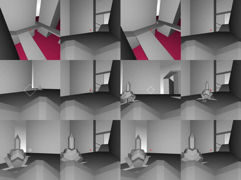
A couple months later, camera problems start to manifest. As players crawl around different surfaces, I have to forcefully nudge the camera to keep it from staring straight into a wall. I use spherical linear interpolation (slerp) to smooth out the transition between angled surfaces, but it's still not great.
In the gif below, the player on the right does not manually move their camera at all; the wall forces them to look up automatically.
At this point, everything is completely unreadable and confusing. The first-person view prevents players from seeing their character, and they often take several minutes to realize they're playing as a creepy crawly spider bot. Once they finally get it, they can't figure out why the camera keeps getting forced around, and why they can't aim at the surface they're attached to.
I slap on another band-aid in the form of a shader that blacks out everything "behind" you, everything that's physically impossible to reach. I also have it darken out of range areas.
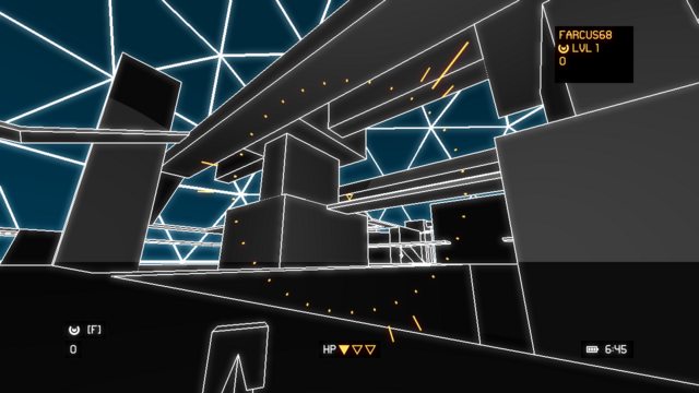
Now the game is not only unreadable and confusing, but also ugly!
By sheer chance, I happen to turn on a debug flag that moves the camera back from the player two units. Literally the poor man's third-person camera. And behold, it was not the worst thing in the world.
I finally realize I'm making a third-person game, and so set about implementing it for real.
The Culling Saga
One of the deadliest scourges of humanity, right after Facebook and taxes, is a third-person camera that constantly zooms and bumps around to avoid in-game geometry.
Rather than move the camera, I decide to just cull anything that blocks the camera's view. Half of the job is done right out the gate because my game engine, like most engines, automatically culls triangles that face away from the camera (also known as "back-faces").
I write a shader to handle the rest. It culls everything within a certain distance of the camera.
What's that you say? My screenshots look weird with spider bots floating in empty space because the wall got culled?
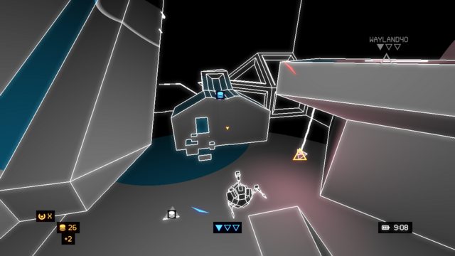
It'll be fine. It's fine. Don't worry about it. What, what now? You can catch glimpses of stuff you're not supposed to see, including the skybox? Look, I'm sure it's just a minor thing.
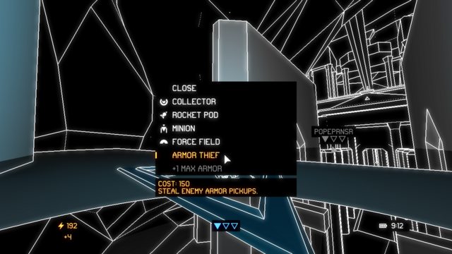
Okay. That's pretty bad.
What if instead of carving spheres around the player and camera, I use a cylinder instead? And what if I actually render a solid black cylinder whenever the camera is inside a wall?
So close, yet so far. The cylinder blocks out most of the ugly geometry it needs to, but sometimes you can still see through things. I could extend the cylinder to block more, but I would have to clip it so it stays inside the level geometry.
Even now, the cylinder sometimes blocks too much, because I only clip it against the player's current wall.
Here I only want the cylinder to block the ugly insides of the ledge. Instead it blocks everything behind the player.
I would have to query all the geometry surrounding the player and clip the cylinder against all those planes. And that's assuming I can figure out what's "inside" and "outside" the level geometry, which is not air-tight. There are overlapping faces, shapes that clip into each other, and plenty of other lazy hacks— I mean, clever tricks.
What if I just turn off back-face culling? Use the same culling shader, and instead of the cylinder, rely on the back-faces to block anything you're not supposed to see. This works perfectly in some cases:
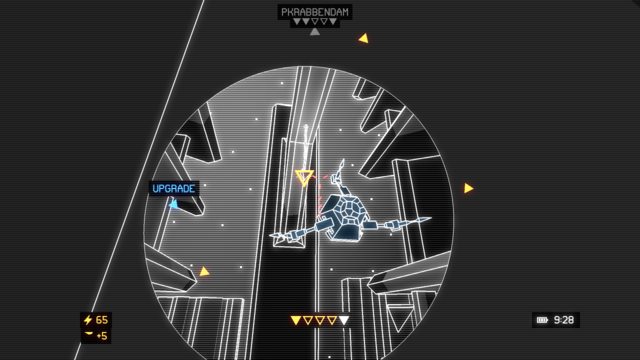
Other times it does a great job of showing off my lazy hacks, like this ramp that simply extends into the floor rather than meeting it cleanly:
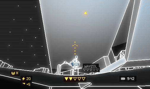
It doesn't help that the back-faces still receive accurate lighting. Feels like the level is a hollow shell.
Fine. I'll spend a couple weeks welding level geometry together, and I'll render the back-faces in solid black. How about now?
Getting less terrible all the time. With a little depth buffer bias, a special tag in the G-buffer for back-faces, and a few extra texture taps in the composite shader, I can filter out those pesky lines too:
The gifs above also show off the new culling shape. Instead of a cylinder, which indiscriminately carves out an uncouth shape much larger than necessary:
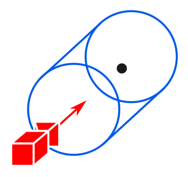
I switch to a cone, to ensure I only cull things what need culling.
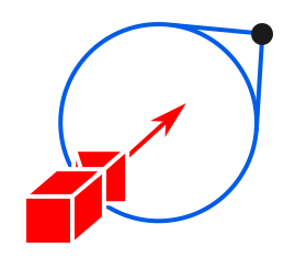
But the cone has problems too. It's possible for the player to back up so close to a wall that the cone intersects the wall in an incredibly narrow circle, leaving a tiny hole for the player to peer through.
From somewhere deep inside my repressed memories of Calc II springs an exotic mathematical creature known as a paraboloid:
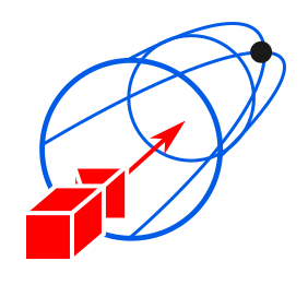
A quick trip to the grimoire to remind myself of the formula, a few incantations in a darkened room with a mirror, and the creature is summoned into GLSL form. The culled circle still tapers a little, but it's enough to see fairly well.
Good enough for government work. Ship it!
UX
UX is, like, super important. Take it from me, a full-stack growth-hacking happiness engineer co-founder. Let me tell you about Our Incredible Journey. At first, the game had a terrible retention rate. I did some A/B testing, streamlined the user onboarding, pivoted to clickbait, bought some fraudulent traffic, and now I'm at $10k MRR. I'm also taking cold showers every morning and learning Farsi on Duolingo.
If you can keep your eyes from rolling back completely and irreparably inside your head, "User Experience" is a decent descriptor for the interactive aspects of game development, the other contender being "Game Feel". It's the thing you can only get by interacting with the software yourself. It's the thing that makes you smile with surprise when you pick up the controller for the first time, even though you've spent the last hour watching someone else play.
It's also basically impossible for me to get right on the first ten tries.
Here's an example of my terrible camera UX. When you hit an enemy player without killing them, you bounce off. The camera instantly snaps around to follow your new trajectory. Of course I slerp the rotation a little, but still, you can barely see it happen.
I have no reason to lock the camera like this, it's just a carry-over from when the game was first-person, when it made sense to always point the camera where the player was headed next.
It takes someone at a convention telling me what an idiot I am to make me finally unlock the camera. A one-line change that takes a whole year.
Later, someone on Twitch yells out a self-evidently brilliant suggestion: let the camera lag behind the player a little when they launch. This also takes only a handful of lines to test out, although the numbers don't feel good until a week or two of tweaking.
So many of my design decisions are simply carried over from old and outdated assumptions, even though they stopped making sense several versions ago.
Here's an example. Remember how I clamp the camera rotation to keep the player from aiming at the surface they're currently attached to?

Turns out this gets old after a while, especially in third-person. People want freedom, they don't want you shoving their camera around. I grudgingly loosen the shackles a bit by clamping the rotation against a cone instead of a plane.
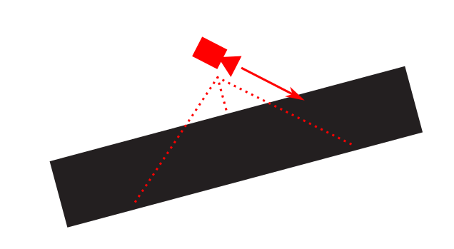
I use spherical interpolation again to smoothly swing the cone around and nudge the camera away from the wall.
Unfortunately, slerp doesn't always rotate the way you want it to. Sometimes the cone pushes the camera in a completely different direction as it rotates to match the surface.
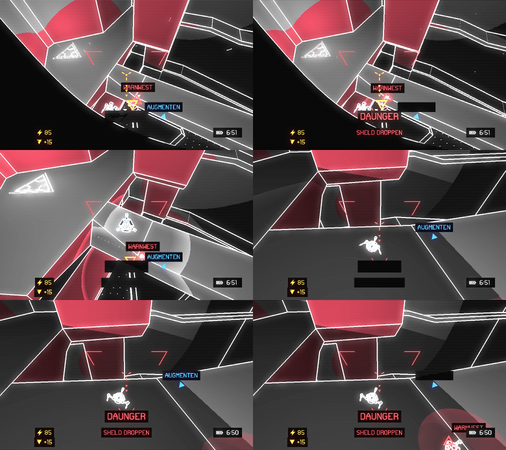
Instead of rotating the cone, I decide to instantly snap it to the surface, but scale it up slowly. So it starts as a thin sliver and slowly expands into a fat cone, pushing the camera out as it grows.
Everything's going just swimmingly until Momin Khan asks me... is it even necessary to clamp the camera any more? It made sense when the game was first-person, but that was two years ago.
I immediately get defensive. How else can I keep the camera from staring straight at the wall for 90% of the game? But I slowly realize he's right.
I compromise in the end. I nudge the camera for a split second after landing, then shrink the cone back down to zero to allow glorious unfettered camera freedom.
Now that the player can aim at their currently attached surface, what happens when they try to launch there?

I eventually solve this problem by allowing spider bots to "dash" along the surface.
I have no physical explanation for how they do it. It's a video game.
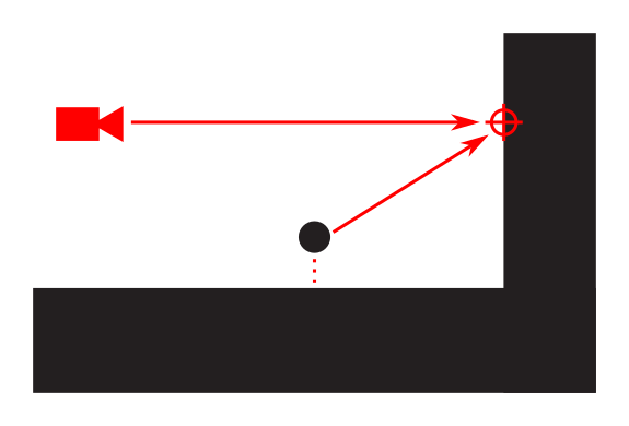
There's another problem, however. Normally, the game does a raycast starting at the third-person camera and continuing straight through the reticle. When the spider bot launches, it compensates and launches where the player wants it to go, like this:
However, sometimes the camera can see and aim at a point the spider bot can't reach.
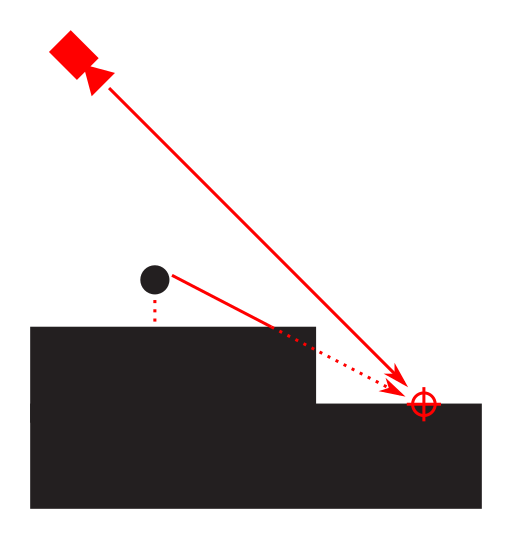
I solve this by ruling everything behind the player's current surface "out of bounds". I even have a shader to darken the forbidden areas.
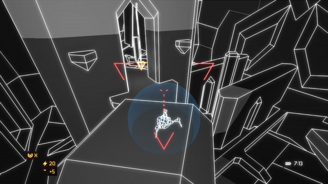
This is really frustrating and confusing to people. Finally Nathan Fouts from Mommy's Best Games tells me to just cheat and let the player go there even if it doesn't make physical sense.
I don't like the idea of breaking my game physics so I compromise by having the spider bot dash to the edge and then fly the rest of the way.
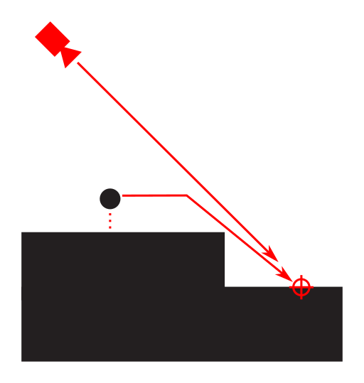
It all happens so fast, you don't even notice it. Here it is in slow motion:
Conclusion
Some tasks cannot be sped up. If I had put "make 3D camera" on a Gantt chart, I would have stopped 10% of the way through this article and called it good.
The point is, most of these ideas are simple and obvious in hindsight, but I had to make a lot of mistakes to find them. It's nearly impossible to coalesce good design decisions straight from the ether. The only reliable method is iteration and trial and error.
Thanks for reading. What embarrassingly obvious design improvements have you been slapped in the face with?
Deceiver is set to launch on Kickstarter in early February 2018. Join the mail list to be notified of its release, or check out the source code on GitHub.